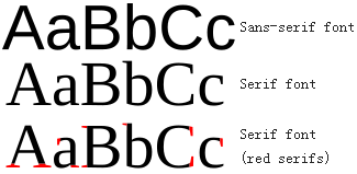
Serif
In typography, a serif is a small line attached to the end of a stroke in a letter or symbol, such as when handwriting is separated into distinct units for a typewriter or typesetter. A typeface with serifs is called a serif typeface (or serifed typeface).
Sans-serif
A typeface without serifs is called sans serif or sans-serif, from the French sans, meaning “without”. Some typography sources refer to sans-serif typefaces as “Grotesque” (in German “grotesk”) or “Gothic”, and serif typefaces as “Roman”.
From Wikipedia
Why you should use sans-serif for you headline today
The battle between serif and sans-serif has never stopped. Generally speaking, serif is considered to be more readable in printed works while sans-serif on screen.
Despite the fact that serif’s stroke act as an elegant decoretion to a letter, sans-serif is more recognizable even when font size is very small, and more importantly, as the trend of Flat Design goes, sans-serif regained its popularity with it neat and clean design. It seems that if you want your Website to stay modern, you should use sans-serif for both headline and content.
In this post, we introduce 10 fonts from Google Fonts that is suitable for your headline.
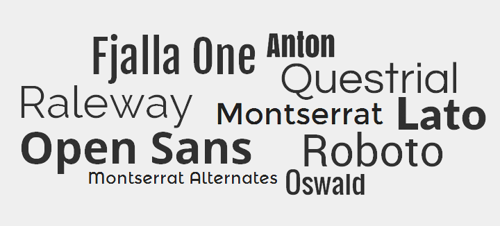
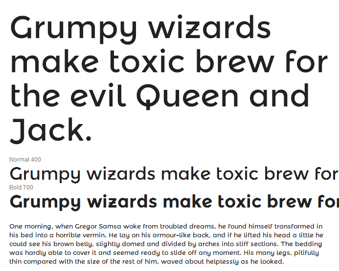
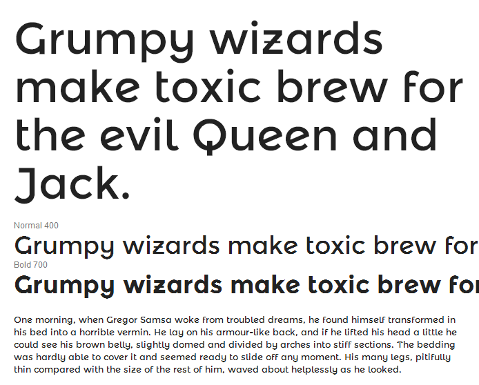
Questrial
Questrial by Joe Prince is the perfect font for body text and headlines on a website. It’s modern style, suited with past characteristics of great typefaces, make it highly readable in any context. The full-circle curves on many characters make Questrial a great font to blend seamlessly with other fonts while still maintaining it’s uniqueness.
It is heavily influenced by Swiss design, similar to a grotesk style which is closely found in Helvetica. The numbers in Questrial are tabular figures so they can be used in tables and forms to enable maximum satisfaction.
Whether to be used for body text or headlines on a web page, Questrial is the right font for any project.
Fjalla One
Fjalla One by Sorkin Type is a medium contrast display sans serif. Fjalla One has been carefully adjusted to the restrictions of the screen. Despite having display characteristics Fjalla One can be used in a wide range of sizes.
Source files are available from Google Code. To contribute to the project contact Eben Sorkin.
Anton
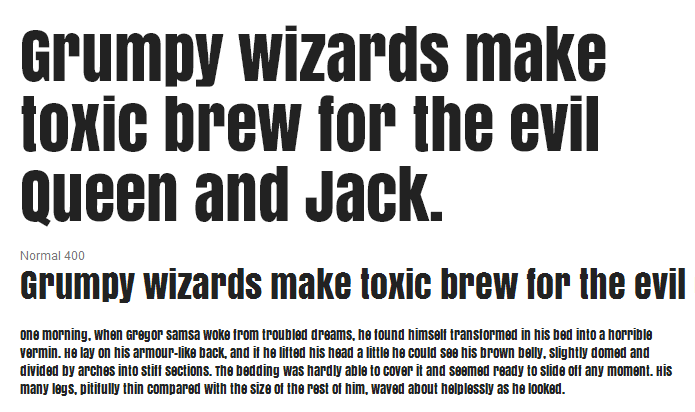
Anton by Vernon Adams is a reworking of a traditional advertising sans serif typeface. The letter forms have been digitised and then reshaped for use as a webfont, the counters have been opened up a little and the stems optimised for use as bold display font in modern web browsers.
Oswald
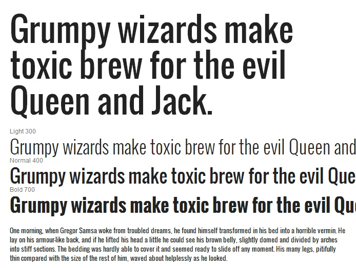
Oswald by Vernon Adams is a reworking of the classic style historically represented by the ‘Alternate Gothic’ sans serif typefaces. The characters of Oswald have been re-drawn and reformed to better fit the pixel grid of standard digital screens. Oswald is designed to be used freely across the internet by web browsers on desktop computers, laptops and mobile devices.
Updated in February 2012 with Light and Bold styles, and Extended Latin character sets.
Updated again in September 2012 based on many users’ feedback, with glyph refinements throughout the family and new tighter spacing and kerning. Users who had adjusted the letterspacing in CSS may need to remove those adjustments.
As one of the earliest families published in Google Web Fonts, Oswald lacked proper subsetting, so this update introduces a default ‘latin’ subset that contains less characters but loads faster. To use the full character set, update your API link to include the latin-ext subset.
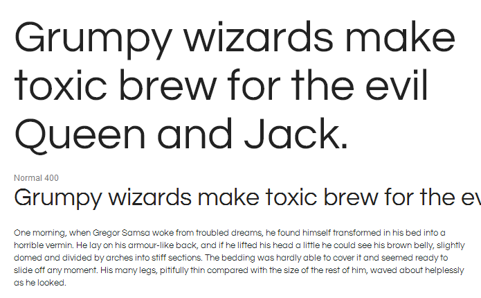
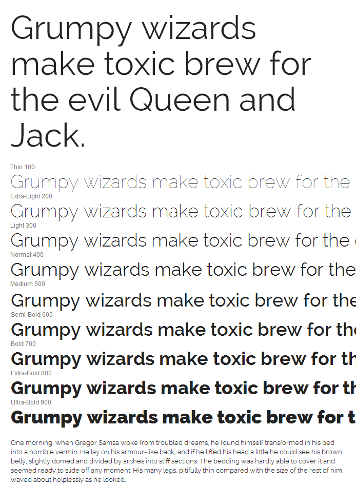
Roboto
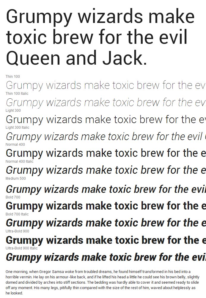
Roboto by Christian Robertson has a dual nature. It has a mechanical skeleton and the forms are largely geometric. At the same time, the font features friendly and open curves. While some grotesks distort their letterforms to force a rigid rhythm, Roboto doesn’t compromise, allowing letters to be settled into their natural width. This makes for a more natural reading rhythm more commonly found in humanist and serif types.
This is the normal family, which can be used alongside the Roboto Condensed family and the Roboto family.
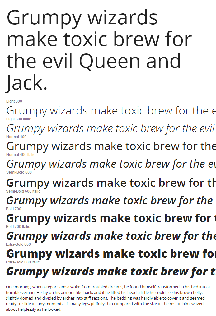
Lato
Lato by Lukasz Dziedzic is a sanserif typeface family designed in the Summer 2010 by Warsaw-based designer Lukasz Dziedzic (“Lato” means “Summer” in Polish). In December 2010 the Lato family was published under the open-source Open Font License by his foundry tyPoland, with support from Google.
In the last ten or so years, during which Lukasz has been designing type, most of his projects were rooted in a particular design task that he needed to solve. With Lato, it was no different. Originally, the family was conceived as a set of corporate fonts for a large client — who in the end decided to go in different stylistic direction, so the family became available for a public release.
When working on Lato, Lukasz tried to carefully balance some potentially conflicting priorities. He wanted to create a typeface that would seem quite “transparent” when used in body text but would display some original traits when used in larger sizes. He used classical proportions (particularly visible in the uppercase) to give the letterforms familiar harmony and elegance. At the same time, he created a sleek sanserif look, which makes evident the fact that Lato was designed in 2010 — even though it does not follow any current trend.
The semi-rounded details of the letters give Lato a feeling of warmth, while the strong structure provides stability and seriousness. “Male and female, serious but friendly. With the feeling of the Summer,” says Lukasz.
Lato consists of five weights (plus corresponding italics), including a beautiful hairline style.
Learn more at www.latofonts.com.
Montserrat
Montserrat is made by Julieta Ulanovsky. The old posters and signs in the traditional neighborhood of Buenos Aires called Montserrat inspired Julieta Ulanovsky to design a typeface that rescues the beauty of urban typography from the first half of the twentieth century. The goal is to rescue what is in Montserrat and set it free, under a free, libre and open source license, the SIL Open Font License.
As urban development changes this place, it will never return to its original form and loses forever the designs that are so special and unique. To draw the letters, I rely on examples of lettering in the urban space. Each selected example produces its own variants in length, width and height proportions, each adding to the Montserrat family. The old typographies and canopies are irretrievable when they are replaced.
There are other revivals, but those do not stay close to the originals. The letters that inspired this project have work, dedication, care, color, contrast, light and life, day and night! These are the types that make the city look so beautiful.
This is the Alternates family, a sister to the Alternates and Subrayada families. Many of the letterforms are special in this family, and ‘Subrayada’ means ‘Underlined’ in Spanish.
Montserrat Alternates
Montserrat Alternates is made by Julieta Ulanovsky. The old posters and signs in the traditional neighborhood of Buenos Aires called Montserrat inspired Julieta Ulanovsky to design a typeface that rescues the beauty of urban typography from the first half of the twentieth century. The goal is to rescue what is in Montserrat and set it free, under a free, libre and open source license, the SIL Open Font License.
As urban development changes this place, it will never return to its original form and loses forever the designs that are so special and unique. To draw the letters, I rely on examples of lettering in the urban space. Each selected example produces its own variants in length, width and height proportions, each adding to the Montserrat family. The old typographies and canopies are irretrievable when they are replaced.
There are other revivals, but those do not stay close to the originals. The letters that inspired this project have work, dedication, care, color, contrast, light and life, day and night! These are the types that make the city look so beautiful.
This is the Alternates family, a sister to the Regular and Subrayada families. Many of the letterforms are special in this family, and ‘Subrayada’ means ‘Underlined’ in Spanish.
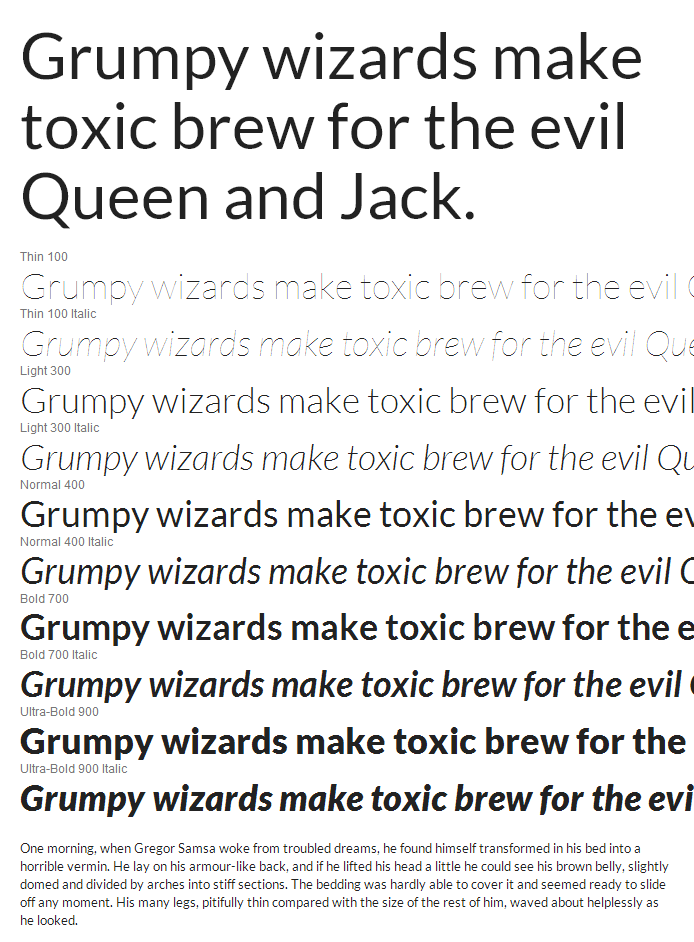
Open Sans
Open Sans by Steve Matteson is a humanist sans serif typeface designed by Steve Matteson, Type Director of Ascender Corp. This version contains the complete 897 character set, which includes the standard ISO Latin 1, Latin CE, Greek and Cyrillic character sets. Open Sans was designed with an upright stress, open forms and a neutral, yet friendly appearance. It was optimized for print, web, and mobile interfaces, and has excellent legibility characteristics in its letterforms.
Raleway
Raleway by Multiple Designers is an elegant sans-serif typeface family. Initially designed by Matt McInerney as a single thin weight, it was expanded into a 9 weight family by Pablo Impallari and Rodrigo Fuenzalida in 2012 and iKerned by Igino Marini.
It is a display face and the download features both old style and lining numerals, standard and discretionary ligatures, a pretty complete set of diacritics, as well as a stylistic alternate inspired by more geometric sans-serif typefaces than its neo-grotesque inspired default character set.
It also has a sister family, Raleway Dots.
Documentation can be found at www.theleagueofmoveabletype.com and www.impallari.com. To contribute to the project contact Matt McInerney or Pablo Impallari.

