This post mainly focuses on CSS positioning. But before that, I’d like to introduce some frequently used CSS propertyies. To learn CSS, you don’t have to know it property by property. Instead, you can totally get to know a new property once you meet with it. Although to be a good Web designer, you need to have a good command of coloring, in this post, we are just going to have a basic idea of it.
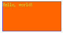
Usually, we can represent a color using the proportion values of red, green and blue. In CSS, a hex value #f31492 or an RGB group value rgb(24, 52, 200) can be used to represent colors.
For hex value #f31492, the first two digits f3 are used to present the red proportion, the next two digits 14 are for green, the last two digits 92 are for blue. Since two hex digits can represent values from 00 to ff, each of red, green, blue components are from 0 to 255. So, #f00910 is equal to rgb(240, 9, 16).
If the hex value is formed like #ff7733, it can be abbreviated to #f73.
color, background-color, border-color
color is used to set the color of text, while background-color and border-color set the color of background and border respectively.
You can set the overflowed content to be hidden using overflow: hidden;, or display a scroll bar when overflow using overflow: auto. If you don’t want a horizontal scroll bar, you can set overflow-x: hidden; overflow-y: auto;.
Besides px unit, which stands for pixel, you can also use percentage to represent width and height. width: 80%; set the width to be 80% of its parent’s. For body, the width: 100% and height: 100% are the width and height of the browser content, which is equal to window.innerWidth and window.innerHeight in JavaScript.
Margin and Padding
Margin is the outside distance from other elements, while padding is the inside distance from its child elements. Let’s see the following example to have a general idea.
Use Inspect Element of Chrome or Firebug of Firefox to have a more deep understanding of this example.
Position
CSS position can sometimes be confusing and in this post, I’m going to talk about it in detail.
display
display is one of the CSS properties that determines position, whose frequently used values are block, inline, inline-block and none.
Different elements have different default values for display, even possibly different default values in different Web browsers. For example, display of <div>, <p> is block by default, while that of <span>, <a> is inline by default. We can overwrite display using CSS as we can always do with other CSS properties.
Next, I’m going to explain what these values mean in detail.
display: block
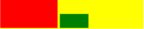
Element with display: block takes the position of area of its own size and the right area of its parents. It’s quite ambiguous to say so… Let’s see it in an example.
Because the default value of display of <div> is block, here although the total width of the red block and the green one is less than that of the yellow block, the green block is shown below the red one, rather than at the right side of the red one.
DIY
Use Inspect Element of Chrome or Firebug of Firefox to see the width, margin of these elements and the highlighted area when hovering an element in Inspect Window.
display: inline-block
We set the display property to be inline-block to the previous example and now the green block is shown right to the red one, since their total width are less than their parent’s width.
You see in this example that they are displayed when there’s text in them. You can see now that when display is set to be inline, the element is rendered, but we can’t control other properties like width, height, margin, padding and etc. any more. You may find it a little confusing, but this is very useful in some cases. For example, we can use <span style="color: red"></span> to highlight some content without changing the text’s position.
display: none
As we can guess from this code, elements with display: none will not be displayed. Why bother writing elements that are not displayed? You may find it extremely helpful when you want to toggle some elements to display and hide.
float
You may probably be familiar with setting an image to float to left or right in Office Word. In CSS, you can also float elements to left or right of its parent. But careful! It can be somehow surprising to you.
Basically, you can set float of the element to be left, right or none if not to float.
This is because when an element is set to be float: left or float: right, it’s height will be no longer counted when computing its parent’s height. So you may need to do as following. See CSS Tricks for more information.
We talked about some useful CSS properties in this post and most importantly, how to control the position of elements. By the end of this post, you should have learnt how to implement Web designs into code. But practice is extremely important in learning HTML and CSS. You need to be patient and learn bit by bit.
You are welcomed to tell me if you find this series helpful and about how you would like me to improve it to help you learn better.
Homework
The inspiring news is that you can make Web sites now!
To build a Web site, you should first design what to show and how to display it. Since we haven’t talked about how to design yet, in this homework, you are given a design image and your task is to implement the design (including all description in the image).
I suggest you put your code on GitHub and share a link as comment to this post, so that we can discuss more about it.
Suggested Answer
Here we give a possible solution. You should ask yourself why this is different from your implementation and ask me if you have any wonder. :smiley: You can use jsFiddle to share your code.
A better way to check this is to run the demo and use Inspect Element for information.
<!DOCTYPE html><html><head><style type="text/css">*{/* Don't use default padding and margin.
* Check: http://css-tricks.com/margin-0-padding-0-no-longer-cool/
*/padding:0;margin:0;box-sizing:border-box;}html,body{/* Usually used for one-screen page.
* height: 100%; means to set the height to be 100% of its parent's.
* Only then, can #left's height: 100% be equal to full window height.
* Otherwise, #left's height: 100% will be 0.
*/width:100%;height:100%;font-family:Arial;}p{font-size:20px;margin:5px0;/* top and bottom are 5px while left and right are 0. */}#left{background-color:#f00;width:200px;height:100%;float:left;padding:10px;/* For #l-bottom to relative to #left, #left should be set to relative
* and #l-bottom to absolute. Otherwise, #left will be relative to html.
*/position:relative;}#l-bottom{position:absolute;bottom:20px;right:20px;text-align:right;}#circle{background-color:#fff;width:60px;height:60px;border-radius:30px;float:right;}#right{background-color:#ff0;height:100%;margin-left:200px;padding:20px50px20px20px;/* top right bottom left */position:relative;}#r-top{background-color:#0f0;padding:10px;margin-bottom:20px;}#title{font-size:50px;color:#f00;text-align:center;}.center{background-color:#0ff;width:30%;/* width 30% each, width margins of 5%. */margin-left:0%;height:160px;float:left;padding:10px;}.center+.center{/* + selects next element in the same level, which is the second
* and the third elements in this case.
*/margin-left:5%;}#r-bottom{position:absolute;bottom:20px;/* Note how we set position instead of setting a width */left:20px;right:50px;}.r-b{padding:5px;margin:5px0;color:#fff;height:30px;}#r-b1{background-color:#0000ff;}#r-b2{background-color:#ff00ff;}</style></head><body><divid="left"><p>#f00</p><p>width: 200px</p><divid="l-bottom"><p>radius: 65px</p><p>margin: 20px</p><divid="circle"></div></div></div><divid="right"><divid="r-top"><p>#0f0, margin: right: 50px, other: 20px</p><divid="title">Title</div><p>Title: center vertically and horizontally</p></div><divid="r-center"><divclass="center"><p>color: #0ff</p><p>height: 160px</p></div><divclass="center"></div><divclass="center"></div></div><p>#ff0, width: window width - 200px</p><divid="r-bottom"><p>The next two are aligned at bottom, height: 60px</p><divid="r-b1"class="r-b">
#0000ff
</div><divid="r-b2"class="r-b">
#0000ff
</div></div></div></body></html>